
![]()
![]()
![]()
![]()
![]()

![]()
For more data on wheat acreage, yield, and production visit: USDA NASS Agricultural Graphics: Field Crops
Remote
Sensing: Wheat
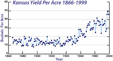
The figure below depicts Kansas wheat yield from 1866 until
1999. This graph displays the number of bushels of wheat produced per acre. Kansas wheat yield was fairly stable from 1866 until about 1945. In
1945, it began to rise dramatically. What may have led to such an overall increase? What may have
caused the yearly ups and downs in wheat yield? Diagram
courtesy Kansas State University.
In addition to directly counting the bushels of wheat produced, scientists can get a qualitative idea of crop yield based on satellite images. The United States Department of Agriculture's National Agricultural Statistics Service (USDA NASS) Agricultural Graphics: Spatial Analysis Research Section has been providing scientists and the public with bi-weekly images of the "greenness" of the United States since 1995. The greenness shows where there is vegetation. This includes crops as well as grasses and trees. Satellite images of this type are useful to scientists at the USDA. The images allow scientists to monitor the vegetation in crop areas. A decrease in the amount of greenness in a crop area may suggest a decrease in the amount of crop present. By examining these maps from the beginning of the crop growing season to the end, scientists can monitor the growth of crops. Scientists can also compare greenness images to the occurrence of events such as droughts, early frosts, and floods. By doing so, scientists may be able to determine the effects of these events on crop yield.
Many scientists have been conducting research to predict the effects of global climate change on crop yield. Climate change may result from increased concentrations of carbon dioxide (CO2) in the air. Increased atmospheric concentrations of CO2 may cause changes in environmental factors such as temperature and precipitation.
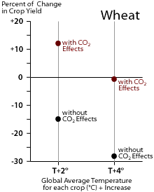 The
Global Change Research
Information Office posted a paper on the Potential
Impacts of Climate Change on Agriculture and Food Supply
. The authors of this paper examined computer models of crop yield.
The models simulated the possible effects of changes in environmental
variables on crop yield. The figure to the right displays the PREDICTED
effects of increased average global surface temperature and increased
carbon dioxide (CO2) on the wheat crop
yield. The black dots represent the effects of temperature increases on crop yield
without the effects of increased CO2. As temperature alone increases, crop
yield dramatically decreases. The red dots represent the effects of the
same temperature increases in the presence of increased CO2. The
negative effects of increased temperature are not as great when increased
CO2 is available to the crops. In fact, crops grown under a temperature
increase of 2 degrees Celsius may actually INCREASE in yield in the
presence of increased CO2. Data
courtesy of the NASA Goddard Institute for Space Studies.
The
Global Change Research
Information Office posted a paper on the Potential
Impacts of Climate Change on Agriculture and Food Supply
. The authors of this paper examined computer models of crop yield.
The models simulated the possible effects of changes in environmental
variables on crop yield. The figure to the right displays the PREDICTED
effects of increased average global surface temperature and increased
carbon dioxide (CO2) on the wheat crop
yield. The black dots represent the effects of temperature increases on crop yield
without the effects of increased CO2. As temperature alone increases, crop
yield dramatically decreases. The red dots represent the effects of the
same temperature increases in the presence of increased CO2. The
negative effects of increased temperature are not as great when increased
CO2 is available to the crops. In fact, crops grown under a temperature
increase of 2 degrees Celsius may actually INCREASE in yield in the
presence of increased CO2. Data
courtesy of the NASA Goddard Institute for Space Studies.
In addition to models, scientists have used field experiments to determine the possible effects of predicted environmental changes on crop yield. This means they have actually grown crops under the current and predicted environmental conditions. The results of these experiments show scientists the actual effects of environmental changes on crop yield.
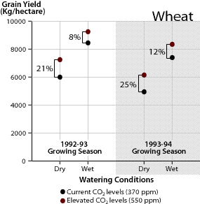 During
one such experiment, scientists examined the effects of water stress (not
enough water) and increased concentrations of CO2 on wheat yield. The
scientists grew wheat in well-watered ("wet") and poorly-watered
("dry") conditions. They exposed these two groups of wheat to
different concentrations of CO2. Part of each group received current levels
of CO2--370 ppm. The remainder of each group received
CO2 at an elevated
concentration--550 ppm. This experiment was conducted during two growing
seasons, 1992-93 and 1993-94. The results are displayed in the above figure.
During
one such experiment, scientists examined the effects of water stress (not
enough water) and increased concentrations of CO2 on wheat yield. The
scientists grew wheat in well-watered ("wet") and poorly-watered
("dry") conditions. They exposed these two groups of wheat to
different concentrations of CO2. Part of each group received current levels
of CO2--370 ppm. The remainder of each group received
CO2 at an elevated
concentration--550 ppm. This experiment was conducted during two growing
seasons, 1992-93 and 1993-94. The results are displayed in the above figure.
During the experiment, poorly-watered ("Dry") wheat produced less yield than well-watered ("Wet") wheat. Increased levels of CO2 resulted in increases in yield for both poorly-watered and well-watered wheat crops. The plants in the poorly-watered group seemed to benefit most from the increase in CO2. These plants displayed a greater amount of yield increase as a result of increased CO2 than the plants in the well-watered group did. These results were observed during two growing seasons, 1992-93 (left) and 1993-94 (right). The overall conclusions from this experiment are that a lack of water can result in a decrease in wheat yield, while an increase in atmospheric CO2 can result in an increase in wheat yield even in dry conditions.
Overview
..|..
Carbon Dioxide ..|..
Temperature
..|..
Precipitation ..|..
Wheat Yield
Glossary ..|..
Related
Links ..|..
References
|..
PBL
Model
Home ..|.. Teacher Pages ..|.. Modules & Activities
HTML code by Chris
Kreger
Maintained by ETE
Team
Last updated November 10, 2004
Some images © 2004 www.clipart.com
Privacy Statement and Copyright © 1997-2004 by Wheeling Jesuit University/NASA-supported Classroom of the Future. All rights reserved.
Center for Educational Technologies, Circuit Board/Apple graphic logo, and COTF Classroom of the Future logo are registered trademarks of Wheeling Jesuit University.