
FEATURED DATA
Global Temperatures
Global Climate Network Temperature Stations
style/images/uploads/800px-GHCN_Temperature_Stations.pngThe Global Historical Climatology Network is a primary reference for temperature data used for climatology research. This map shows 7,280 temperature stations coded by years of data records. “Active” sites update the database; historical sites have collected data but do not contribute to current data. The United States is the most densely instrumented region of the globe; Antarctica is the least. The longest record in the network collection began in Berlin in 1701 and continues to the present.
Credits
This figure was created by Robert A. Rohde from published data and is incorporated into the Global Warming Art project. This image is an original work created for Global Warming Art. Please refer to the image description page for more information.
Jones, P. D., & Moberg, A. (2003). Hemispheric and large-scale surface air temperature variations: An extensive revision and an update to 2001. Journal of Climate, 16, 206-223.
Peterson, T. C., & Vose. R. S. (1997). An overview of the Global Historical Climatology Network temperature data base. Bulletin of the American Meteorological Society, 78, 2837-2849.
Vose, R. S., Schmoyer, R. L., Steurer, P. M., Peterson, T. C., Heim, R., Karl, T. R., & Eischeid, J. (1992). The Global Historical Climatology Network: Long-term monthly temperature, precipitation, sea level pressure, and station pressure data. Oak Ridge, TN: Carbon Dioxide Information Analysis Center, Oak Ridge National Laboratory.
Permission is granted to copy, distribute, and/or modify this document under the terms of the GNU Free Documentation License, Version 1.2 or any later version published by the Free Software Foundation; with no invariant sections, no front-cover texts, and no back-cover texts. A copy of the license is included in the section entitled GNU Free Documentation License.
Website for this image
http://www.globalwarmingart.com/wiki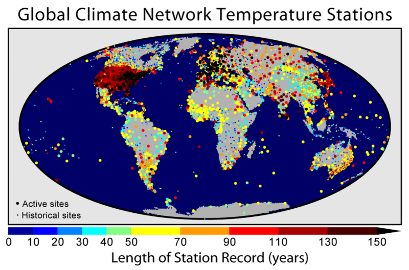
Annual Greenhouse Gas Emissions by Sector
style/images/uploads/Greenhouse_Gas_by_Sector.pngData sets from the Emission Database for Global Atmospheric Research, version 3.2, Fast Track 2000 project. Use the top graphic to find out the sources and amounts for the greenhouse gases shown in the graphics at the bottom. For example, looking at carbon dioxide, 29.5% of the emissions (shown in red) come from power stations, and 19.2% of carbon dioxide emissions come from transportation fuels (as shown in gold).
Credits
Image created by Robert A. Rohde/Global Warming Art.
Website for this image
http://www.globalwarmingart.com/wiki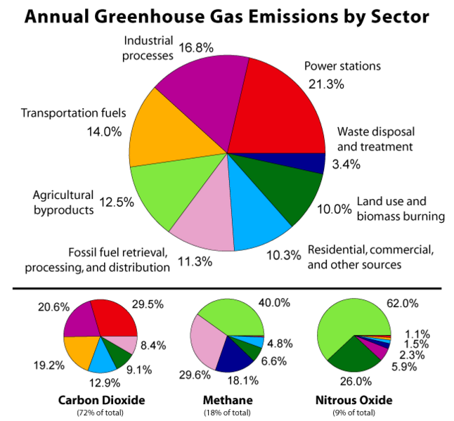
Carbon Dioxide Variations
style/images/uploads/Carbon_Dioxide_400kyr_Rev.pngScientists have drilled deep cores through the icecap in Antarctica. Measurements of CO2 captured in annual ice deposits in the cores allow scientists to reconstruct atmospheric CO2 variations over the last 400,000 years.
Notice the large variations in concentrations every 100,000 years. This occurs because of periodic changes in Earth's orbit.
Notice the additional graph inserted within the larger graph. This shows that CO2 abundance has increased steadily since the Industrial Revolution started in the 1700s and in the last 100 years has increased from about 275 parts per million (ppm) to about 375 ppm. This new high is greater than any CO2 measurement from the last 400,000 years. Is this evidence for natural CO2 variation or human-caused variation? Is there evidence for natural variation in these data?
Credits
Image create by Robert A. Rohde/Global Warming Art.
Etheridge, D. M., Steele, L. P., Langenfelds, R. L., Francey, R. J., Barnola, J.-M., & Morgan, V. I. (1998). Historical CO2 records from the Law Dome DE08, DE08-2, and DSS ice cores. Trends: A compendium of data on global change. Oak Ridge, TN: Carbon Dioxide Information Analysis Center, Oak Ridge National Laboratory, U.S. Department of Energy.
Keeling, C.D., & Whorf, T. P. (2004). Atmospheric CO2 records from sites in the SIO air sampling network. Trends: A compendium of data on global change. Oak Ridge, TN: Carbon Dioxide Information Analysis Center, Oak Ridge National Laboratory, U.S. Department of Energy.
Monnin, E., Steig, E. J., Siegenthaler, U., Kawamura, K., Schwander, J., Stauffer, B., Stocker, T. F., Morse, D. L., Barnola, J.-M., Bellier, B., Raynaud, D., & Fischer, H. (2004). Evidence for substantial accumulation rate variability in Antarctica during the Holocene, through synchronization of CO2 in the Taylor Dome, Dome C and DML ice cores. Earth and Planetary Science Letters 224, 45-54.
Neftel, A., Friedli, H., Moor, E., Lötscher, H., Oeschger, H., Siegenthaler, U., & Stauffer, B. (1994). Historical CO2 record from the Siple Station ice core. Trends: A compendium of data on global change. Oak Ridge, TN: Carbon Dioxide Information Analysis Center, Oak Ridge National Laboratory, U.S. Department of Energy.
Petit J. R., Jouzel, J., Raynaud, D., Barkov, N. I., Barnola, J. M., Basile, I., Bender, M., Chappellaz, J., Davis, J., Delaygue, G., Delmotte, M., Kotlyakov, V. M., Legrand, M., Lipenkov, V., Lorius, C., Pépin, L., Ritz, C., Saltzman, E., Stievenard, M. (1999). Climate and atmospheric history of the past 420,000 years from the Vostok Ice Core, Antarctica. Nature, 399, 429-436.
Website for this image
http://www.globalwarmingart.com/wiki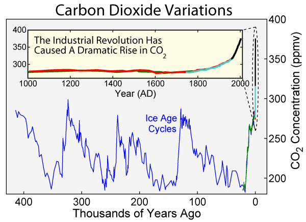
Global Trends in Major Greenhouse Gases to 1/2003
style/images/uploads/Major_greenhouse_gas_trends.pngThe rise in greenhouse gas concentrations are believed to cause most of the increase in global temperatures during the last 50 years.
Credits
This image is a work of the National Oceanic and Atmospheric Administration, taken or made during the course of an employee's official duties. As works of the U.S. federal government, all NOAA images are in the public domain.
Source: http://www.esrl.noaa.gov/gmd/
Website for this image
http://www.globalwarmingart.com/wiki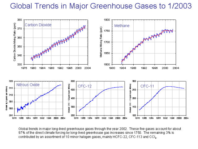
Carbon Dioxide Concentration and Flux
style/images/uploads/481px-Carbon_History_and_Flux_Rev.pngTop Graph: Measurements of atmospheric carbon dioxide in ppm by volume.
Bottom Graph: Annual flux inward of carbon dioxide entering the atmosphere.
The top graph shows carbon dioxide concentrations in parts per million by volume (ppmv) for both direct atmospheric measurements and ice core measurements for the years given in the bottom graph. The bottom graph depicts the amount of change inward of carbon dioxide entering the atmosphere.
Credits
Image created by Robert A. Rohde/Global Warming Art.
Measured carbon concentrations
Keeling, C. D., & Whorf, T. P. (2004). Atmospheric CO2 records from sites in the SIO air sampling network. Trends: A compendium of data on global change. Oak Ridge, TN: Carbon Dioxide Information Analysis Center, Oak Ridge National Laboratory, U.S. Department of Energy. .
Ice core data
Etheridge, D. M., Steele, L. P., Langenfelds, R. L., Francey, R. J., Barnola, J.-M., & Morgan, V. I. (1998). Historical CO2records from the Law Dome DE08, DE08-2, and DSS ice cores. Trends: A compendium of data on global change. Oak Ridge, TN: Carbon Dioxide Information Analysis Center, Oak Ridge National Laboratory, U.S. Department of Energy
Neftel, A., Friedli, H., Moor, E., Lötscher, H., Oeschger, H., Siegenthaler, U., & Stauffer, B. (1994). Historical CO2record from the Siple Station ice core. Trends: A compendium of data on global change. Oak Ridge, TN: Carbon Dioxide Information Analysis Center, Oak Ridge National Laboratory, U.S. Department of Energy.
Monnin, E., Steig, E. J., Siegenthaler, U., Kawamura, K., Schwander, J., Stauffer, B., Stocker, T. F., Morse, D. L., Barnola, J.-M., Bellier, B., Raynaud, D., & Fischer, H. (2004). Evidence for substantial accumulation rate variability in Antarctica during the Holocene, through synchronization of CO2 in the Taylor Dome, Dome C and DML ice cores. Earth and Planetary Science Letters 224, 45-54.
Fossil fuel carbon flux
Marland, G., Boden, T. A., & Andres, R. J. (2003). Global, regional, and national CO2 emissions. Trends: A compendium of data on global change. Oak Ridge, TN: Carbon Dioxide Information Analysis Center, Oak Ridge National Laboratory, U.S. Department of Energy.
Website for this image
http://www.globalwarmingart.com/wiki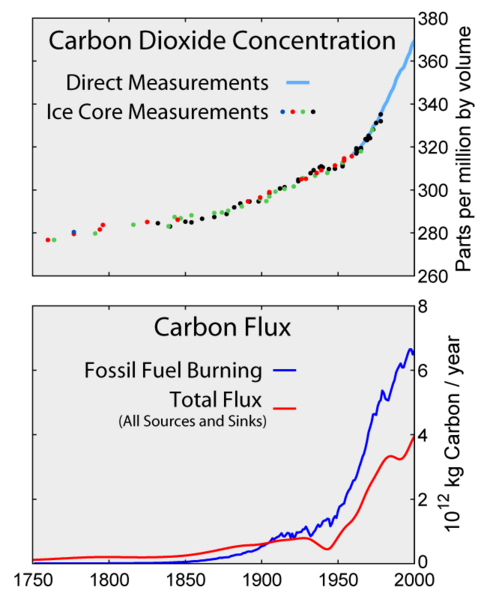
Annual Carbon Emissions
style/images/uploads/Carbon_Emission_by_Region.pngThis graph shows the total atmospheric carbon dioxide concentrations in million metric tons of carbon/year from 1800-2000. It also shows the atmospheric CO2 concentrations from varying fossil fuel sources as well as from cement production.
Credits
Image created by Robert A. Rohde/Global Warming Art.
Data Source: Carbon Dioxide Information Analysis Center (CDIAC), which is the primary climate change data and information analysis center of the U.S. Department of Energy (DOE). CDIAC is located at DOE's Oak Ridge National Laboratory and includes the World Data Center for Atmospheric Trace Gases.
Website for this image
http://www.globalwarmingart.com/wiki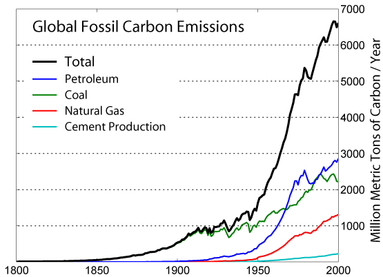
Economic Efficiency of Fossil Fuel Usage
style/images/uploads/Fossil_Fuel_Efficiency.pngThe bar graph illustrates how efficiently the world’s 20 largest economies convert fossil fuel usage into a measure of wealth (their gross national product). Here, the measure is purchasing power in U.S. dollars over the number of kilograms of fossil fuel carbon released into the atmosphere each year. The two countries that produce the highest GDP per kilogram carbon, Brazil and France, rely much more on the alternative energy sources of hydroelectric power and nuclear power than other countries.
Credits
Image created by Robert A. Rohde/Global Warming Art.
Website for this image
http://www.globalwarmingart.com/wiki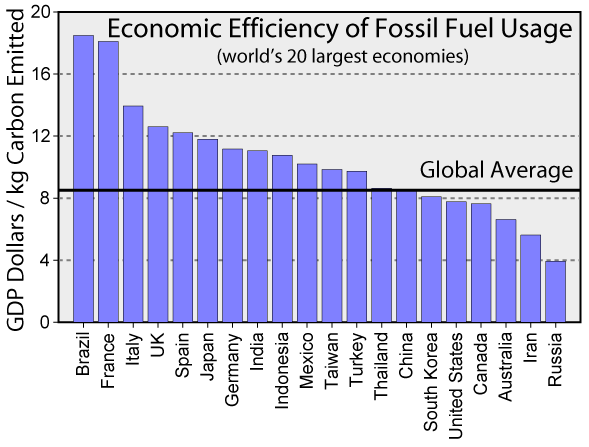
Fossil Fuel Usage per Capita
style/images/uploads/Fossil_Fuel_Usage.pngThis graph shows fossil fuel consumption per capita for the 20 countries with the largest populations. U.S. consumption more than doubles that of the next highest user, Russia.
Credits
Image created by Robert A. Rohde/Global Warming Art.
Website for this image
http://www.globalwarmingart.com/wiki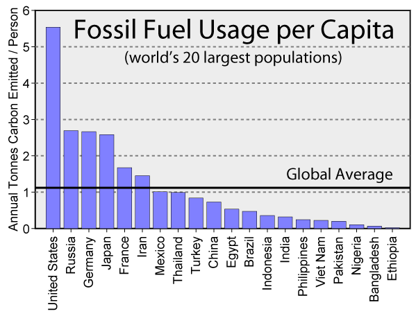
Indicators of the Human Influence on the Atmosphere During the Industrial Era
style/images/uploads/Human Influence during Industrial Era.gifGlobal atmospheric concentrations of three well-mixed greenhouse gases. The data show a steep upward trend since the Industrial Revolution.
Credits
Figures reproduced with the kind permission of the Intergovernmental Panel on Climate Change (IPCC).
Website for this image
http://www.ghgonline.org/humaninfluencebig.htm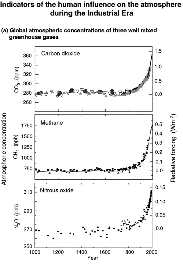
Atmospheric Concentrations of Carbon Dioxide
style/images/uploads/AtmosphericConcentrations.gifAtmospheric concentrations of carbon dioxide dating back to some 647,000 years BC show a sharp spike upward in the mid to late 20th century.
Credits
EPA—Climate Change
Barnola, J.-M., Raynaud, D., Lorius, C., & Barkov, N. I. (2003). Historical CO2 record from the Vostok ice core. Trends: A compendium of data on global change. Oak Ridge, TN: Carbon Dioxide Information Analysis Center, Oak Ridge National Laboratory, U.S. Department of Energy.
Chamard, P., Ciattaglia, L., di Sarra, A., & Monteleone, F. (2001). Atmospheric CO2 record from flask measurements at Lampedusa Island, Trends: A compendium of data on global change. Oak Ridge, TN: Carbon Dioxide Information Analysis Center, Oak Ridge National Laboratory, U.S. Department of Energy.
Etheridge, D. M., Steele, L. P., Langenfelds, R. L., Francey, R. J., Barnola, J.-M., & Morgan, V. I. (1998). Historical CO2 records from the Law Dome DE08, DE08-2, and DSS ice cores. In Trends: A Compendium of Data on Global Change. Carbon Dioxide Information Analysis Center, Oak Ridge National Laboratory, U.S. Department of Energy, Oak Ridge, Tenn., U.S.A.
Flückiger, J., Monnin, E., Stauffer, B., Schwander, J., Stocker, T. F., Chappellaz, J., Raynaud, D., & Barnola, J. M. (2002). High resolution Holocene N2O ice core record and its relationship with CH4 and CO2. Glob. Biogeochem. Cycles 16(1), March, 10.1029/2001GB001417.
National Oceanic and Atmospheric Administration, Earth System Research Laboratory, Global Monitoring Division. 2007. Monthly mean CO2 concentrations from Mauna Loa, Hawaii. (Retrieved May 29, 2007).
Neftel, A., Friedli, H., Moor, E., Lötscher, H., Oeschger, H., Siegenthaler, U., & Stauffer, B. (1994). Historical CO2 record from the Siple Station ice core. Trends: A compendium of data on global change. Oak Ridge, TN: Carbon Dioxide Information Analysis Center, Oak Ridge National Laboratory, U.S. Department of Energy.
Siegenthaler, U., Stocker, T. F., Monnin, E., Lüthi, D., Schwander, J., Stauffer, B., Raynaud, D., Barnola, J. M., Fischer, H., Masson-Delmotte, V., & Jouzel, J. (2005). Stable carbon cycle-climate relationship during the Late Pleistocene. Science, 310,1313-1317. Data.
Steele, L. P., Krummel, P. B., & Langenfelds, R. L. (2002). Atmospheric CO2 concentrations from sites in the CSIRO Atmospheric Research GASLAB air sampling network (October 2002 version). Trends: A compendium of data on global change. Oak Ridge, TN: Carbon Dioxide Information Analysis Center, Oak Ridge National Laboratory, U.S. Department of Energy.
Thoning, K. W., & Tans, P. P. (2000). Atmospheric CO2 records from sites in the NOAA/CMDL continuous monitoring network. Trends: A compendium of data on global change. Oak Ridge, TN: Carbon Dioxide Information Analysis Center, Oak Ridge National Laboratory, U.S. Department of Energy.
Website for this image
http://www.epa.gov/climatechange/science/recentac_...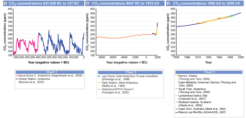
Atmospheric Concentrations of Methane
style/images/uploads/AtmosphericConcentrations2.gifAtmospheric concentrations of methane dating back to some 648,000 years BC show a sharp spike upward in the last few decades.
Credits
EPA—Climate Change
Blunier, T., & Brook, E. J. (2001, Jan. 5). Timing of millennial-scale climate change in Antarctica and Greenland during the last glacial period. Science, 291, 109-112.
Etheridge, E. J., Steele, L. P., Francey, R. J., & Langenfelds, R. L. (2002). Historical CH4 records since about 1000 A.D. from ice core data. Trends: A compendium of data on global change. Oak Ridge, TN: Carbon Dioxide Information Analysis Center, Oak Ridge National Laboratory, U.S. Department of Energy.
Flückiger, J., Monnin, E., Stauffer, B., Schwander, J., Stocker, T. F., Chappellaz, J., Raynaud, D., & Barnola, J. M. (2002). High resolution Holocene N2O ice core record and its relationship with CH4 and CO2. Glob. Biogeochem. Cycles 16(1), March, 10.1029/2001GB001417. Data.
Hashida, G., Morimoto, S., Aoki, S. & Nakazawa, T. World Data Centre for Greenhouse Gases. Data.
Petit J. R., Jouzel, J.,Raynaud, D., Barkov, N. I., Barnola, J. M., Basile, I., Bender, M., Chappellaz, J., Davis, J., Delaygue, G., Delmotte, M., Kotlyakov, V. M., Legrand, M., Lipenkov, V., Lorius, C., Pépin, L., Ritz, C., Saltzman, E., & Stievenard, M. (1999). Climate and atmospheric history of the past 420,000 years from the Vostok Ice Core, Antarctica. Nature, 399, 429-436. Data.
Spahni, R., Chappellaz, J., Stocker, T. F., Loulergue, L., Hausammann, G., Kawamura, K., Flückiger, J., Schwander, J., Raynaud, D., Masson-Delmotte, V., & Jouzel, J. (2005). Atmospheric methane and nitrous oxide of the late Pleistocene from Antarctic ice cores. Science, 310, 1317-1321. Data.
Steele, L. P., Krummel, P. B., & Langenfelds, R. L. (2002). Atmospheric CH4 concentrations from sites in the CSIRO Atmospheric Research GASLAB air sampling network (October 2002 version). Trends: A compendium of data on global change. Oak Ridge, TN: Carbon Dioxide Information Analysis Center, Oak Ridge National Laboratory, U.S. Department of Energy.
Website for this image
http://www.epa.gov/climatechange/science/recentac_...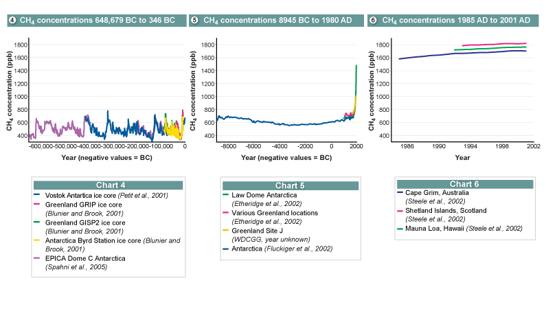
Aqua: Carbon Dioxide - Last 31 Days
style/images/uploads/Carbon.jpgTo view this interactive image follow the below steps:
Step 1 - Go to http://climate.nasa.gov/Eyes/eyes.html#.
Step 2 - Click the Download button.
Step 3 - Select the Satellite Aqua either on the top scroll menu or on the globe.
Step 4 - On the right side bar under SHOW DATA MAP, select Carbon Dioxide - Last 31 Days.
Credits
Source: JPL, NASA.
Website for this image
http://climate.nasa.gov/Eyes/eyes.html#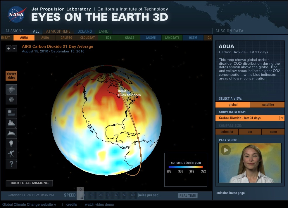
Urban Heat Islands
http://eoimages.gsfc.nasa.gov/images/imagerecords/47000/47704/buffalo_etm_2002215.jpgBy evaporating water, plants cool their surroundings. By replacing plants with impervious surfaces, cities trap heat and create a phenomenon known as the urban heat island. A variety of factors affect the urban heat island. Bigger cities tend to have stronger heat-trapping capacities than smaller cites. Cities surrounded by forest have more pronounced heat islands than do cities in arid environments. A study presented at the 2010 fall meeting of the American Geophysical Union found that a city’s layout—whether sprawling or compact—can also affect the potency of its urban heat island.
This image shows Buffalo, NY, on Aug. 3, 2002. Acquired by the Enhanced Thematic Mapper on NASA’s Landsat 7 satellite, they show temperature, ranging from blue (warm) to beige (hot). White lines delineate city limits. The researchers found that Buffalo has surface temperatures just 7.2 degrees Celsius (almost 13 degrees Fahrenheit) warmer than its surroundings.
Credits
Imhoff, M. L., Zhang, P., Wolfe, R. E., & Bounoua, L. (2010). Remote sensing of the urban heat island effect across biomes in the continental USA. Remote Sensing of Environment, 114(3), 504–513.
Voiland, A. (2010, Dec. 13). Satellites pinpoint drivers of urban heat islands in the northeast. NASA. Retrieved De. 13, 2010.
Zhang, P., Imhoff, M. L. Wolfe, R. E., & Bounoua, L. (2010). Detecting urban heat island drivers in northeast USA cities using MODIS and Landsat products. Fall 2010 meeting of the American Geophysical Union.
Links:
Beating in the Heat in the World's Big Citites
Urban Heat Island: Baltimore, MD
New York City Temperature and Vegetation
NASA Earth Observatory image created by Jesse Allen and Robert Simmon, using Landsat data provided by the United States Geological Survey. Caption by Michon Scott.
Instrument: Landsat 7 - ETM+
Website for this image
http://earthobservatory.nasa.gov/IOTD/view.php?id=...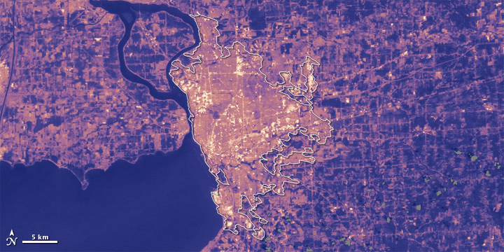
Earth Now: Air Temperature
style/images/uploads/ete1.jpgNASA's Earth Now is an application that visualizes recent global climate data from Earth science satellites, including surface air temperature, carbon dioxide, carbon monoxide, ozone, and water vapor as well as gravity and sea level variations. Data sets are visually described using "false color" maps. Color-coded legends are provided to indicate relative strength or weakness of an environmental condition. The resulting 3D model of the Earth may be rotated by a single finger stroke and may also be zoomed in or out by pinching two fingers. It was developed by the Earth Science Communications and Visualization Technology Applications and Development Teams at NASA's Jet Propulsion Laboratory, with support from NASA headquarters.
Link to App: http://itunes.apple.com/us/app/earth-now/id494633346?mt=8
Credits
App Cost: Free
Category: Education
Released: Jan. 18, 2012
Version: 1.2
Size: 9.5 MB
Language: English
Seller: Jet Propulsion Laboratory © 2012 California Institute of Technology
Rated 4+
App. Requirements: Compatible with iPhone 3GS, iPhone 4, iPhone 4S, iPod touch (3rd generation), iPod touch (4th generation) and iPad. Requires iOS 5.0 or later.
Website for this image
http://itunes.apple.com/us/app/earth-now/id4946333...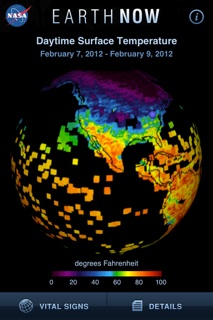
Global Temperature Trends
style/images/uploads/Instrumental_Temperature_Record.pngThe record of global average temperatures compiled by NASA’s Goddard Institute for Space Studies. The “zero” on this graph corresponds to the mean temperature from 1961-1990, as directed by the Intergovernmental Panel of Climate Change (IPCC).
Credits
Image created by Robert A. Rohde/Global Warming Art.
Hansen, J., Sato, Mki., Ruedy, R., Lo, K., Lea, D. W., & Medina-Elizade, M. (2006). Global temperature change. Proc. Natl. Acad. Sci., 103, 14288-14293.
Houghton, J. T., Ding, Y., Griggs, D. J., Noguer, M., van der Linden, P. J., Dai, X., Maskell, K., & Johnson, C. A. (Eds.) (2001). Climate change 2001: The scientific basis. Contribution of Working Group I to the Third Assessment Report of the Intergovernmental Panel on Climate Change. Cambridge, UK: Cambridge University Press. ISBN 0521807670.
Folland, C. K., Rayner, N. A., Brown, S. J., Smith, T. M., Shen, S. S. P., Parker, D. E., Macadam, I., Jones, P. D., Jones, R. N., Nicholls, N., & Sexton, D. M. H. (2001). Global temperature change and its uncertainties since 1861. Geophysical Research Letters, 28, 2621-2624.
Website for this image
http://www.globalwarmingart.com/images/f/f4/Instru...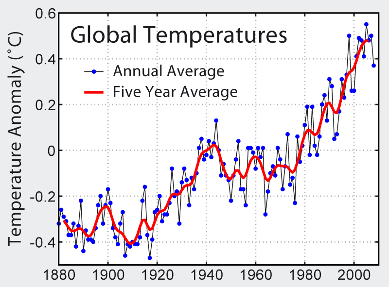
1999-2008 Mean Temperatures
style/images/uploads/Global_Warming_Map.jpgThis figure shows the difference in surface temperatures from January 1999 through December 2008. The average increase on this graph is 0.48 degrees Celsius. The widespread temperature increases are considered to be an aspect of global climate change.
Credits
Image created by Robert A. Rohde/Global Warming Art.
Hansen, J., Ruedy, R., Sato, M., Imhoff, M., Lawrence, W., Easterling, D., Peterson, T., & Karl, T. (2001). A closer look at United States and global surface temperature change. Journal of Geophysical Research, 106, 23947-23963.
Rayner, N. (2000). HadISST1 sea ice and sea surface temperature files. Bracknell, UK: Hadley Center.
Reynolds, R. W., Rayner, N. A., Smith, T. M., Stokes, D. C., & Wang, W. (2002). An improved in situ and satellite SST analysis for climate. J. Climate, 15, 1609-1625.
Website for this image
http://www.globalwarmingart.com/images/8/8c/Global...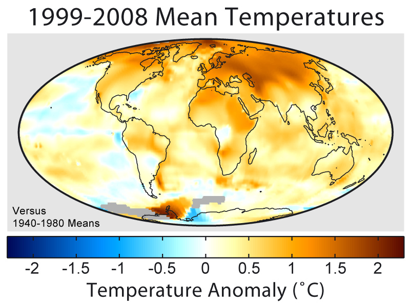
Temperature Anomalies 1880-2010
style/images/uploads/TempAnomalies 1880-2010.gifThis graph depicts temperature anomalies from 1880-2010 from meteorological stations, showing both annual means and a five-year mean. The anomalies clearly show a trend of increasing temperatures starting in the 1970s.
Credits
This file is in the public domain because it was created by NASA. NASA copyright policy states that "NASA material is not protected by copyright unless noted." (See Template:PD-USGov, NASA copyright policy page or JPL Image Use Policy.)
Sato, 2010.
Website for this image
http://www2.sunysuffolk.edu/mandias/global_warming...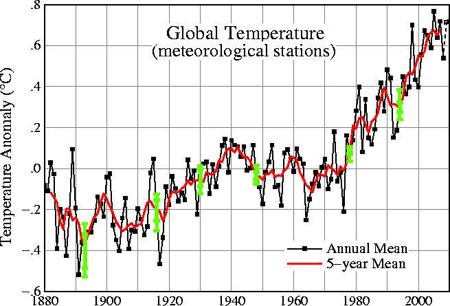
Global Land-Ocean Temperature Index
style/images/uploads/LandOceanTemp.gifThis graph depicts temperature anomalies from meteorological stations, showing both annual means and a five-year mean from 1880-2010. Temperatures show a clear upward trend since the 1970s.
Credits
This file is in the public domain because it was created by NASA. NASA copyright policy states that "NASA material is not protected by copyright unless noted." (See Template:PD-USGov, NASA copyright policy page or JPL Image Use Policy.)
Sato, 2010.
Website for this image
http://www2.sunysuffolk.edu/mandias/global_warming...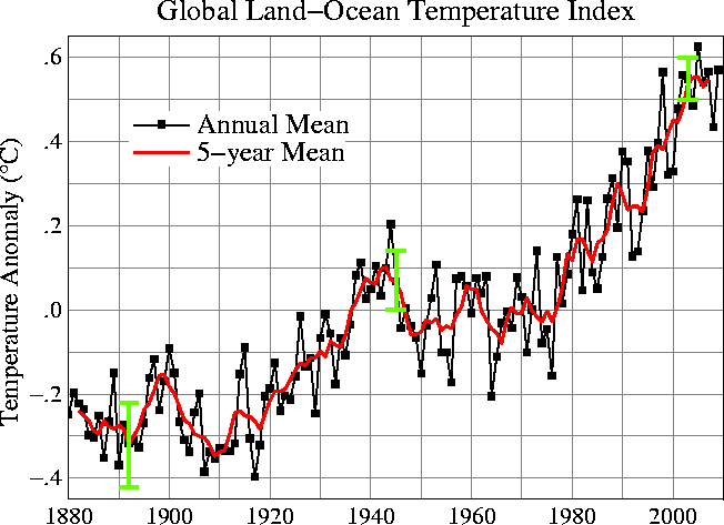
Surface Temperature Record
style/images/uploads/SurfaceTemp.pngThe graph illustrates average surface temperature measurements from data collected by the Hadley Centre of the UK Meteorological Office and the Climatic Research Unit of the University of East Anglia. The graph also depicts a history of variations in the El Nino Southern Oscillation and the period of eruption of the Mount Pinatubo volcano.
Credits
Image created by Robert A. Rohdes/Global Warming Art.
Brohan, P., Kennedy, J.J. Harris, I., Tett, S.F.B., & Jones, P.D. (2006). Uncertainty estimates in regional and global observed temperature changes: a new dataset from 1850. Journal of Geophysical Research, 111, D12106.
Luo, Z., Rossow, W.B., Inoue, T., & Stubenrauch, C.J. (2002). Did the eruption of the Mt. Pinatubo volcano affect cirrus properties?. Journal of Climate, 15, 2806-2820.
Website for this image
http://www.globalwarmingart.com/wiki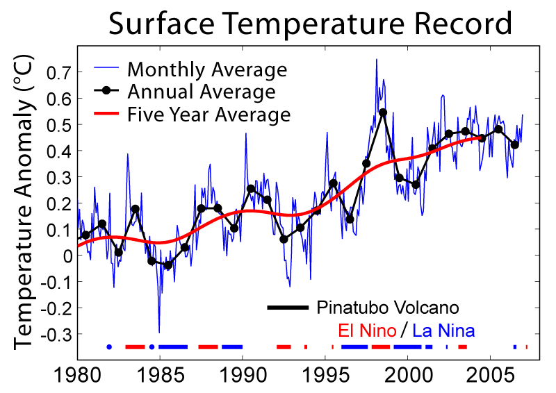
Global Warming Projections
style/images/uploads/GlobalWarmingProjections.pngA graph of climate model predictions for global warming with data collected by the SRES A2 emissions scenario. The A2 scenario describes a politically and socially diverse world in which no special actions are taken to address global warming or environmental change issues. This 2100 world has large population, high energy use, and moderate levels of fossil fuel dependency.
Credits
The summary data presented in this graph was based information provided by the following research groups: CCSR/NIES—Center for Climate System Research/National Institute for Environmental Studies; CCCma—Canadian Center for Climate Modelling and Analysis; CSIRO—Commonwealth Scientific and Industrial Research Organisation; Hadley Centre—Hadley Centre for Climate Prediction and Researc; GFDL—Geophysical Fluid Dynamics Laboratory; MPI-M—Max Planck Institute fur Meteorologie; NCAR PCM—National Center for Atmospheric Research, PCM model; and the NCAR CSM—National Center for Atmospheric Research, CSM model.
Image created by Robert A. Rohde/Global Warming Art.
Houghton, J. T.,Ding, Y., Griggs, D. J., Noguer, M., van der Linden, P. J., Dai, X., Maskell, K., & Johnson, C. A. (eds.) (2001). Climate Change 2001: The Scientific Basis. Contribution of Working Group I to the Third Assessment Report of the Intergovernmental Panel on Climate Change. Cambridge, UK: Cambridge University Press. ISBN 0521807670.
Website for this image
http://www.globalwarmingart.com/wiki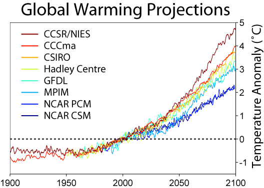
Temperature Increase 2000 to 2100
style/images/uploads/TempIncrease2000to2100.pngThis chart lists research centers, organizations, or laboratories which have conducted extensive global temperature studies. Their predicted inrease in global temperatures to the year 2100 are listed for both land and ocean environments. The data suggests land will warm more rapidly probably becasue of its lower specific heat.
The sources of data are listed below.
CCSR/NIES—Center for Climate System Research/National Institute for Environmental Studies
CCCma—Canadian Center for Climate Modelling and Analysis
CSIRO—Commonwealth Scientific and Industrial Research Organisation
Hadley Centre—Hadley Centre for Climate Prediction and Research
GFDL—Geophysical Fluid Dynamics Laboratory
MPI-M—Max Planck Institute fur Meteorologie
NCAR PCM—National Center for Atmospheric Research, PCM model
NCAR CSM—National Center for Atmospheric Research, CSM model
Credits
Image created by Robert A. Rohde/Global Warming Art.
Houghton, J. T., Ding, Y., Griggs, D. J., Noguer, M., van der Linden, P. J., Dai, X., Maskell, K., & Johnson, C. A. (Eds.) (2001). Climate change 2001: The scientific basis.Contribution of Working Group I to the Third Assessment Report of the Intergovernmental Panel on Climate Change. Cambridge, UK: Cambridge University Press. ISBN 0521807670.
Website for this image
http://www.globalwarmingart.com/wiki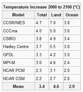
Global Warming Predictions
style/images/uploads/Global_Warming_Predictions_Map.jpgThe graph shows the predicted temperature change because of global climate change as issued by the Hadley Centre climate model. The colors show predicted average temperature changes for 2070-2100. Notice the distinct warming difference between land and water. The strong warming around the Arctic Ocean is related to melting sea ice, and the strong warming in South America is related to El Nino cycles. (Models differ according to variables considered.)
Credits
Image created by Robert A. Rohde/Global Warming Art.
Data sets from Hadley Centre HadCM3 climate model.
Website for this image
http://www.globalwarmingart.com/wiki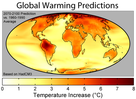
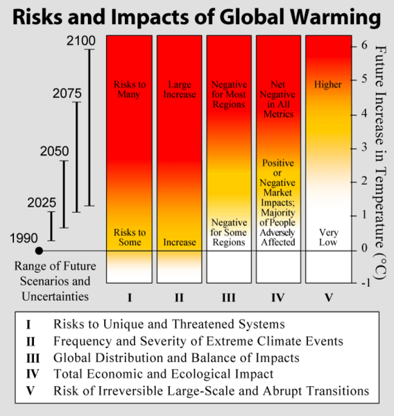
Risks and Impacts of Global Warming
style/images/uploads/568px-Risks_and_Impacts_of_Global_Warming.pngThis Intergovernmental Panel on Climate Change (IPCC) table of risks and impacts of global warming depicts an assessment of the relative impact and risks associated with global climate change. Five categories are assessed.The bars are color coded to show level of impact or concern for each factor as a function of temperature increase.
Credits
Image created by Robert A. Rohde/Global Warming Art.
Data source: Third Assessment Report of the Intergovernmental Panel on Climate Change (IPCC).
Website for this image
http://www.globalwarmingart.com/wiki