  |
Yellowstone Biomass Burning The burning of surface vegetation
occurs constantly around the world. Many of the fires are due to natural causes such as
lightning strikes, but many are due to human activity. Some of the human-caused fires are
accidental such as those spreading from neglected camp fires. Others are intentional such
as fires set by farmers in developing nations such as Brazil and the Democratic Republic
of the Congo to clear fields with a minimum of effort for planting. (Unfortunately, such
agricultural fires have several disadvantages, including the release of CO2 in to the atmosphere and the loss of organic
material and nutrients that could have been retained by plowing the vegetation into the
ground rather than burning it. But that is another story.) Photo:
Courtesy of EarthRISE. The burning of surface vegetation
occurs constantly around the world. Many of the fires are due to natural causes such as
lightning strikes, but many are due to human activity. Some of the human-caused fires are
accidental such as those spreading from neglected camp fires. Others are intentional such
as fires set by farmers in developing nations such as Brazil and the Democratic Republic
of the Congo to clear fields with a minimum of effort for planting. (Unfortunately, such
agricultural fires have several disadvantages, including the release of CO2 in to the atmosphere and the loss of organic
material and nutrients that could have been retained by plowing the vegetation into the
ground rather than burning it. But that is another story.) Photo:
Courtesy of EarthRISE.One of the most spectacular recent biomass fires in the United States in recent history occurred in Yellowstone National Park during the summer of 1988. The fire, really a series of related fires, burned through much of the park's land. The relevant questions here are how much CO2 was released in to the atmosphere and how significant is that amount compared to the changes in CO2 concentration seen on the Mauna Loa data curve.
For this activity, open the stack in NIH Image. Use the < and > keys to cycle back and forth through the stack to see the changes before and after the fire. When you are ready, select Stacks/Stacks to Windows and move the 1987 and 1988 images and the map around on your screen to where you can see them all at the same time. Use the scale on the map to set the scale of the 1988 image. Select at least the area option under Analyze/Options.... Use the 1987 image to help you identify burned areas in the 1988 image, and then use the freehand area measuring tool to carefully outline a section of burned area. Don't try to outline all of the burned area at once. (It can't be done.) Select Analyze/Measure to measure the area of each outlined section in square kilometers. When you have measured all of the burned areas in the 1988 image, add all of your measured areas together to obtain the total burned area. Once you have totaled the burned area, estimate the amount of carbon released from the burned vegetation. The attached table provides estimates of carbon in various types of vegetation. The ground cover in Yellowstone consists of conifer forest and some grassland. For a quick estimate of the carbon released, use the values in the table to estimate an average mass of carbon per area and multiply by the burned area. To get a more precise result, try estimating the areas of burned forest and fields separately and using the appropriate values of mass of carbon per area to find the total carbon released. You might also think about the effects of incomplete burning. The accuracy of the measured area impacts the accuracy of the calculated mass of carbon released. There are several ways to estimate the accuracy of the measured area. If you are working alone, simply remeasure the burned areas two or three times. You might try using a different order or pattern of outlines for each set of measurements. If you are working with other students or have several other groups measuring the burned areas at the same time, collect all of the measurements and compare them. Discuss any differences, particularly any measurements that are greatly different from the others. Typically in science, multiple measurements of the same quantity are made. An average of the measurements with an attached statistical uncertainty is then used as the final value. Consider why scientists usually use this approach. Once you have an estimate of the carbon released to the atmosphere by the Yellowstone fire, convert it to concentration of CO2 in parts per million by volume and compare it with the concentrations in the CO2 curve. Did the Yellowstone fire release enough carbon to significantly contribute to the observed increase of CO2? Now that you have estimated the amount of CO2 released to the atmosphere by a single large fire, consider the release of CO2 by all the fires burning worldwide during an entire year. There are literally millions of fires around the globe each year, many of which are purposely started by people. Some are small, like camp fires, while others are large, such as those set by farmers clearing fields or forests for planting. Though people start fires all through the year, fires set to clear fields are typically most numerous during the local spring season, as illustrated by the DMSP images of eastern India below.
Biomass burning is widespread throughout the developing world: India, Southeast Asia, Africa, Central America, and South America. It is difficult to get accurate statistics on the amount of biomass burned each year, and scientists have begun using satellite images to get better estimates. For example, here is a movie ( ) showing biomass burning on the continent of Africa through an entire year, from July 1993 through June 1994. The movie is derived from maps in the Fire Index Atlas by O. Arino & J. M. Melinotte for the European Space Agency. The maps show a quantity called the "fire index," which is derived from AVHRR data. In each frame, the gray and white colors represent areas with no measurable fires. All of the other colors, from dark green to yellow, show increasing number of fires. The location and number of fires change throughout the year and largely follow the beginning of local growing seasons in each area. Measurements like the fire index are combined with other sources of information to obtain estimates of the average amount of global biomass burned each year. The tables below present an estimate of annual global biomass burning by biomass type and by geographic region. Table data: Courtesy of M. O. Andreae (1991) in Global Biomass Burning: Atmospheric, Climatic, and Biospheric Implications, J. S. Levine, ed., MIT Press, Cambridge MA, p. 8.
Convert the mass of carbon released globally by biomass burning to ppmv of CO2. Compare your results with the Mauna Loa data to see how global biomass burning might contribute to the global increase in CO2. Consider whether the CO2 released each year by biomass burning would contribute cumulatively or cyclically to the world CO2 totals.
[ Yellowstone Biomass Burning ] [ Seasonal
Vegetation Changes ] [ Home ] [ Teacher Pages ] [ Modules & Activities ] |
|||||||||||||||||||||||||||||||||||
![]()
HTML code by Chris Kreger
Maintained by ETE Team
Last updated November 10, 2004
Some images © 2004 www.clipart.com
Privacy Statement and Copyright © 1997-2004 by Wheeling Jesuit University/NASA-supported Classroom of the Future. All rights reserved.
Center for Educational Technologies, Circuit Board/Apple graphic logo, and COTF Classroom of the Future logo are registered trademarks of Wheeling Jesuit University.
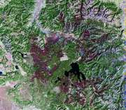 The Landsat image below (ID # L5038029008828410) was taken in late
September 1988, shortly after the last of the fires was put out. The burned area shows in
shades of purple. This image is also included in this
The Landsat image below (ID # L5038029008828410) was taken in late
September 1988, shortly after the last of the fires was put out. The burned area shows in
shades of purple. This image is also included in this 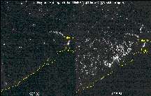 The image on the left was taken in
September 1992. Locally it is early fall, the time of harvest. Many spots of light are
visible, but nearly all of them are city lights, such as those at left center of Calcutta,
a city of over 12 million people. The image at right, taken in April 1994, shows many more
lights. Locally, the season is now early spring, the time of preparing fields for
planting. The lights of Calcutta and other cities are still visible in the image, almost
unchanged, but they are joined by vast numbers of fires in rural regions--farmers are
using fires to clear their fields in preparation for planting. Note that each image is
about 800 km (500 miles) across, so the area covered by the fires is very large. For
comparison, remember that the image above of the burned area of the Yellowstone fire is
only about 185 km (115 miles) across. Images: Courtesy of NOAA/DOC/AFGWC and imagery by NGDC.
The image on the left was taken in
September 1992. Locally it is early fall, the time of harvest. Many spots of light are
visible, but nearly all of them are city lights, such as those at left center of Calcutta,
a city of over 12 million people. The image at right, taken in April 1994, shows many more
lights. Locally, the season is now early spring, the time of preparing fields for
planting. The lights of Calcutta and other cities are still visible in the image, almost
unchanged, but they are joined by vast numbers of fires in rural regions--farmers are
using fires to clear their fields in preparation for planting. Note that each image is
about 800 km (500 miles) across, so the area covered by the fires is very large. For
comparison, remember that the image above of the burned area of the Yellowstone fire is
only about 185 km (115 miles) across. Images: Courtesy of NOAA/DOC/AFGWC and imagery by NGDC.